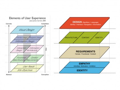
This post is the last of three arguments presenting a perspective on what will be important and interesting in regards to identity and design the coming two to three years: Which is how identity and design transforms as the artificial barriers of technology disappears and people change their behaviors.
And how this affects the natural, constant and unstoppable evolution of what it takes to remain valuable as a company.
Read the first post: Organic
Read the second post: Visual and experiential language
—
Part three: Identities
One of the most influential models for building stuff on the Internet the last decade has been a model called “Elements of the user experience” designed by Adaptive path co-founder and president Jesse James Gareth, presented in a book by the same name.
The model gives an insightful introduction to creating online experiences from the bottom up, going through elements such as objectives, specifications, architecture, navigation and in the end visual design
dealing with ED patients. buy viagra online combination of L-arginine and yohimbine..
.
With deep respect for the clarity the model ads to the logic of creating applications online, it has always been a bit weak regarding it’s focus on building Identities. Especially since it treats identity as merely an element for decorating the application, implemented through visual clues in order to enhance logic and apply rules in the interface – or meet some minimum requirements in regards to brand guidelines
.
Now, where this would be anticipated back in 2000 (when the model was designed), interaction with technology, people’s behavior online and a company’s ambitions and demand for effect have changed dramatically. And as everything else, our models need to be updated to meet the current market. (It most likely already is?)
Whereas the model is generic enough to still represent a practical broken down approach to a complex process, it is especially in regards to how identities are built, communicated and engaged with where the model seems to be outdated.
The model treats important visual signifiers, the visual language of a company’s identity, as nothing more than interaction elements. Hoping to protect the brand from bad use-experiences, rather than with the ambition of establishing an identity and a relation with the person engaging in the experience
.
The visual language has always had a strong and essential representation on surfaces serving as interactions between people and their brands, but on organic surfaces, facilitated by digital technology, there seems to be a different prioritization, regarding the importance of a company’s identity.
At the same time, identity is not merely visual; it is also the result of an experience. And where as one often claims that the goal of this experience on organic surfaces needs to be free from the hindrance of bad visual decoration and critical errors in logic, usability itself seems to have little effect on brand loyalty (S.S.Srinivasana et
. al
. 2002) – we need to go a step further, which most people agree on.
- (Not to be confused! Critiques of design often criticize bad decoration as bad design, when in fact they have nothing to do with each other, design is the solution of problems, decoration is meaningless noise.)
– We need to keep our focus on achieving smart services through the language of visual design and design logic, but at the same time we need to look broader, in the direction of creating brand identity through inviting people in and doing stuff, solving tasks or achieving goals
.
Identity on organic surfaces is just as much about designing signifiers for activities as for the visual representation.
This is not new, and has been performed for ages, but it is often in the discussion around identity that this aspect is left out, and one concentrates on the visual brand and the brand story – not the engagement and activity itself.
In this regard, and using the Elements of User Experience model as a base, I would suggest changing “site objectives”, on the bottom pane, to “identity”. As it more clearly illustrates the goal of the service. And that the top panes flatten out and becomes one simultaneous process (which many web agencies have been exploring for years already), including architecture, navigation and identity which all have an equally important stake in how the interface should be presented to create the most valuable and identifiable experience.
The model is just for illustration purposes and does not represent an attempted update.


this is a great insight, Helge. you should definitely try to refine this model, this can change a lot the way digital agencies think nowadays.